This comprehensive guide will walk you through everything you need to know about creating powerful financial dashboards in Excel—from basic setup to advanced techniques that will impress both clients and colleagues. You’ll learn how to select the right metrics, design intuitive layouts, and implement dynamic features that update automatically as your data changes.
What Is a Financial Dashboard in Excel?
A financial dashboard in Excel is a visual representation of your business’s key financial metrics and KPIs (Key Performance Indicators). Unlike standard financial reports, dashboards present data in an intuitive, graphical format that allows you to quickly identify trends, spot anomalies, and make data-driven decisions without wading through rows of numbers.
The power of Excel dashboards lies in their ability to:
- Consolidate data from multiple sources into a single view
- Transform complex financial information into easy-to-understand visuals
- Provide real-time or near real-time updates as your data changes
- Enable interactive filtering and analysis without altering source data
- Automate routine financial reporting processes
For business owners and financial professionals, a well-designed Excel dashboard eliminates hours of manual reporting and provides immediate insights that drive better financial decisions.
Types of Financial Dashboards for Business
Different business needs require different dashboard approaches. Here are the most common types of financial dashboards you can create in Excel:
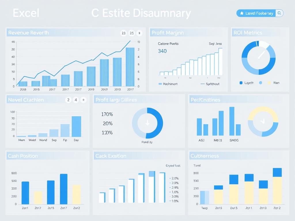
Executive Financial Dashboard
Provides high-level financial overview for C-suite executives and board members. Includes key metrics like revenue growth, profit margins, cash position, and ROI.
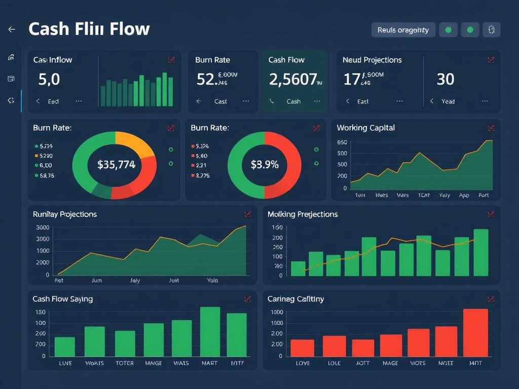
Cash Flow Dashboard
Tracks money moving in and out of your business. Features cash inflows, outflows, burn rate, runway projections, and working capital metrics—critical for managing liquidity.
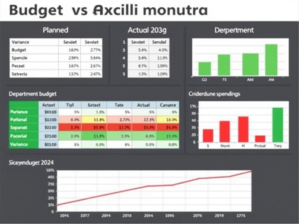
Budget vs. Actual Dashboard
Compares planned budgets against actual performance. Highlights variances, helps identify overspending, and enables proactive financial management.
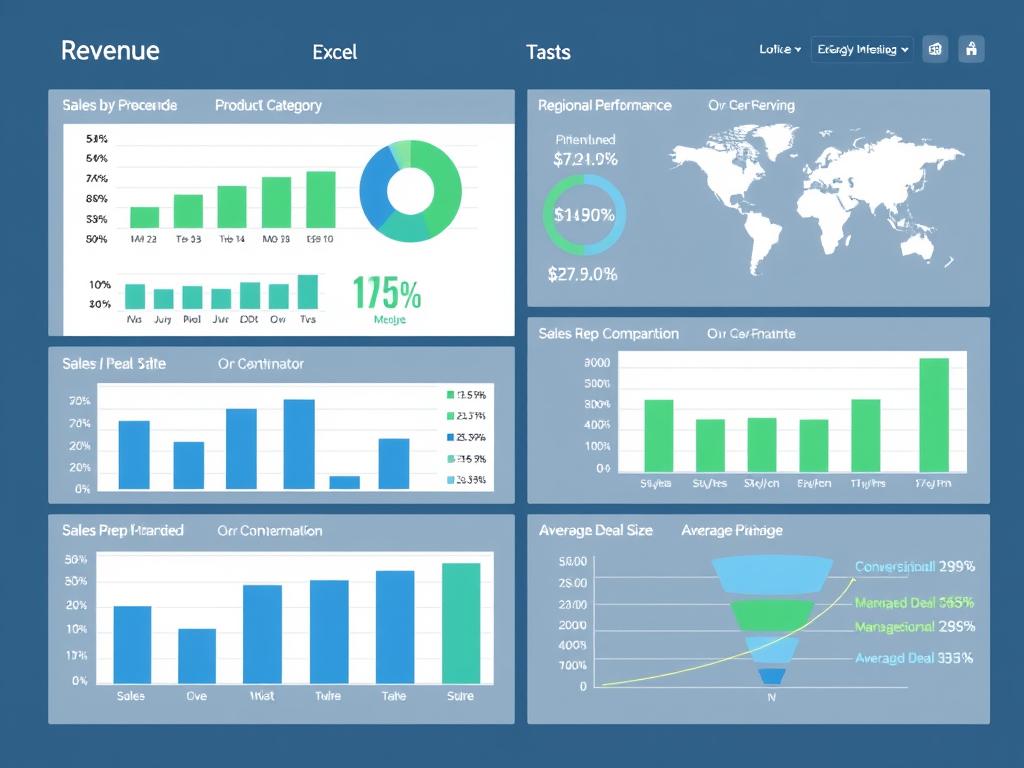
Sales Performance Dashboard
Focuses on revenue metrics like sales by product, region, or sales rep. Includes conversion rates, average deal size, and sales pipeline visualization.
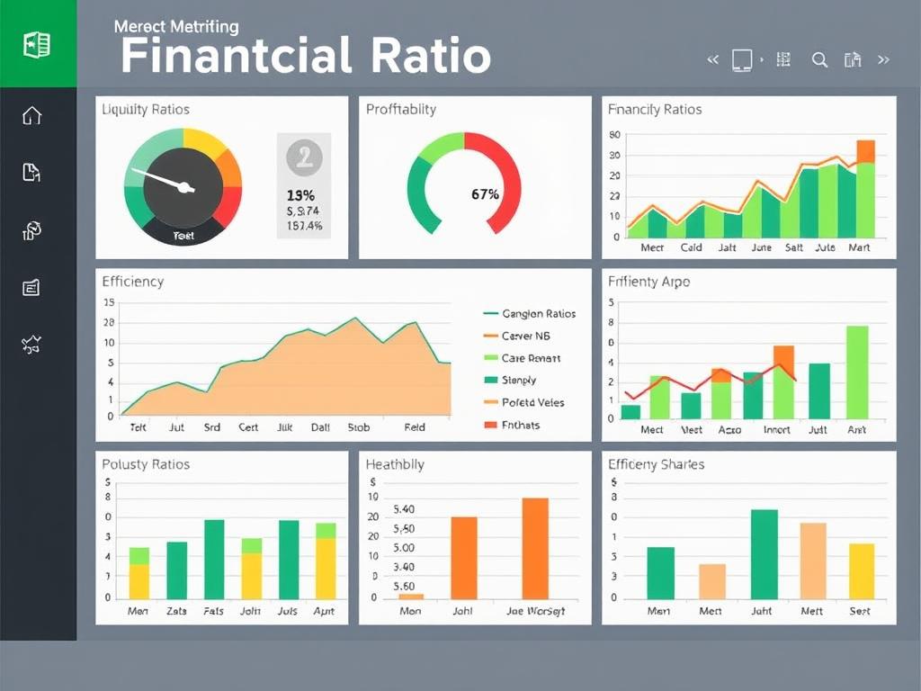
Financial Ratio Dashboard
Displays key financial ratios like liquidity, profitability, and efficiency metrics. Helps track financial health and benchmark against industry standards.
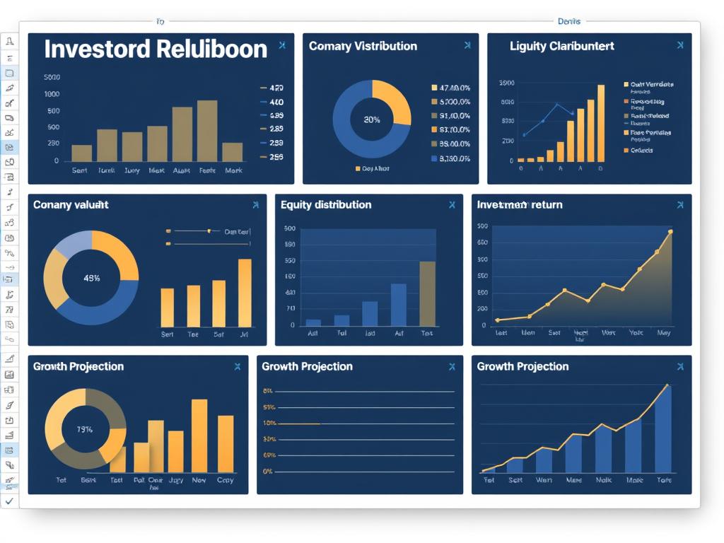
Investor Relations Dashboard
Designed for stakeholders and investors. Showcases company valuation, equity distribution, investment returns, and growth projections.
The most effective approach is often to create a master dashboard with high-level metrics that can drill down into specialized dashboards for deeper analysis. This provides both the big picture and detailed insights when needed.
Essential Metrics for Your Financial Dashboard
The effectiveness of your financial dashboard depends on selecting the right metrics. While specific KPIs will vary based on your business type and goals, these fundamental financial metrics provide a solid foundation:
Revenue Metrics
- Total Revenue: Overall income before expenses
- Revenue Growth Rate: Percentage change over time
- Revenue by Segment: Breakdown by product, service, or division
- Average Transaction Value: Mean revenue per sale
Profitability Metrics
- Gross Profit Margin: (Revenue – COGS) ÷ Revenue
- Net Profit Margin: Net Income ÷ Revenue
- EBITDA: Earnings before interest, taxes, depreciation, and amortization
- Contribution Margin: Revenue – Variable Costs
Liquidity Metrics
- Current Ratio: Current Assets ÷ Current Liabilities
- Quick Ratio: (Current Assets – Inventory) ÷ Current Liabilities
- Cash Conversion Cycle: DIO + DSO – DPO
- Burn Rate: Rate at which cash is being spent
Efficiency Metrics
- Inventory Turnover: COGS ÷ Average Inventory
- Accounts Receivable Turnover: Net Credit Sales ÷ Average Accounts Receivable
- Return on Assets (ROA): Net Income ÷ Total Assets
- Operating Expense Ratio: Operating Expenses ÷ Revenue
Pro Tip: Limit your main dashboard to 5-7 of your most critical KPIs to avoid information overload. Create secondary dashboards for deeper dives into specific areas.
Building Your Financial Dashboard in Excel: Step-by-Step
Creating an effective financial dashboard in Excel requires thoughtful planning and execution. Follow these steps to build a dashboard that delivers meaningful insights:
- Organize Your DataBefore building visualizations, structure your data properly. Create a dedicated data sheet separate from your dashboard. Use Excel tables (Insert > Table) to make your data dynamic and easier to reference in formulas.
- Plan Your LayoutSketch your dashboard layout before building. Place the most important metrics in the top-left quadrant (where eyes naturally go first). Group related metrics together and ensure a logical flow of information.
- Create Basic ChartsBuild your core visualizations using Excel’s chart tools. Common financial visualizations include:
- Line charts for trends over time (revenue growth, profit margins)
- Bar/column charts for comparisons (budget vs. actual)
- Pie/donut charts for composition (revenue by segment)
- Sparklines for compact trend visualization
- Gauge charts for KPIs with targets
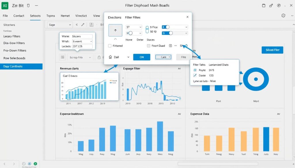
- Add Interactive ElementsMake your dashboard dynamic with slicers, drop-down filters, and timelines. These allow users to filter data without altering the underlying structure.
- Implement Dynamic FormulasUse formulas that update automatically as data changes:
- SUMIFS/COUNTIFS for conditional calculations
- INDEX/MATCH or XLOOKUP for flexible lookups
- OFFSET for dynamic ranges
- IFERROR to handle exceptions gracefully
- Add Conditional FormattingHighlight important insights with conditional formatting. Use color scales, icon sets, and data bars to make trends and outliers immediately visible.
- Refine Visual DesignCreate a professional appearance by maintaining consistent colors, fonts, and formatting. Remove gridlines, use subtle borders, and align elements precisely for a clean look.
Ready to Build Your Financial Dashboard?
Download our free Excel dashboard templates and start tracking your business performance today. Each template is fully customizable to your specific needs.
Advanced Excel Dashboard Techniques
Once you’ve mastered the basics, these advanced techniques will take your financial dashboards to the next level:
Dynamic Named Ranges
Create charts that automatically expand as new data is added using OFFSET or INDEX functions with the Name Manager. This ensures your dashboard always displays complete data without manual adjustments.
Example formula:
=OFFSET(Sheet1!$B$2,0,0,COUNTA(Sheet1!$B:$B)-1,1)
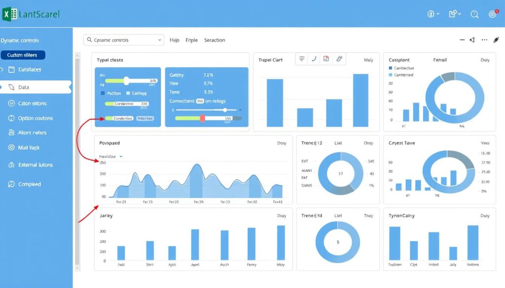
Custom Dashboard Controls
Build interactive controls beyond standard slicers using form controls, scroll bars, or option buttons. These can control date ranges, toggle between metrics, or adjust forecast parameters.
Implementation: Insert > Form Controls > Option Button/Scroll Bar/etc.
Automated Data Refresh
Connect your dashboard to external data sources (accounting software, CRM, etc.) using Power Query. Schedule automatic refreshes to ensure your dashboard always shows current data.
Access via: Data > Get Data > From Other Sources
Power User Tip: Combine Excel with Power BI for even more advanced data visualization capabilities while maintaining the familiar Excel interface for data management.
Financial Dashboard Example: Cash Flow Analysis
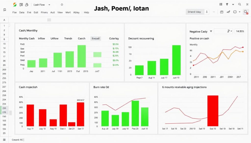
Let’s examine a practical example of how a financial dashboard can transform raw data into actionable insights. This cash flow dashboard helps a business owner monitor liquidity and make proactive financial decisions.
Key Components of This Dashboard:
1. Cash Position Summary
The top section provides an immediate overview of current cash position, change from previous period, and days of runway remaining. The gauge chart shows how current cash compares to target reserves.
2. Cash Flow Trend
The line chart tracks cash balance over time, with projected values shown in a lighter shade. This visualization immediately reveals seasonal patterns and potential future cash crunches.
3. Income vs. Expenses
The stacked column chart compares monthly inflows and outflows, with the net change highlighted. This helps identify months with negative cash flow that require attention.
4. Accounts Receivable Aging
This section tracks outstanding invoices by age category, helping prioritize collection efforts to improve cash flow. The dashboard automatically flags concerning trends in late payments.
“After implementing this cash flow dashboard, we identified a seasonal pattern that was creating cash shortages. By adjusting our invoice timing and expense scheduling, we improved our cash position by 23% within three months.”
This dashboard example demonstrates how visualizing financial data can reveal insights that might be missed in traditional financial statements, enabling proactive rather than reactive financial management.
Financial Dashboard Templates You Can Use Today
Why start from scratch when you can leverage pre-built templates? Here are three professional Excel dashboard templates you can download and customize for your business:
Executive Financial Overview
![]()
Perfect for business owners and executives who need a high-level view of company performance. Includes revenue trends, profit margins, cash position, and key financial ratios on a single page.
Budget vs. Actual Tracker
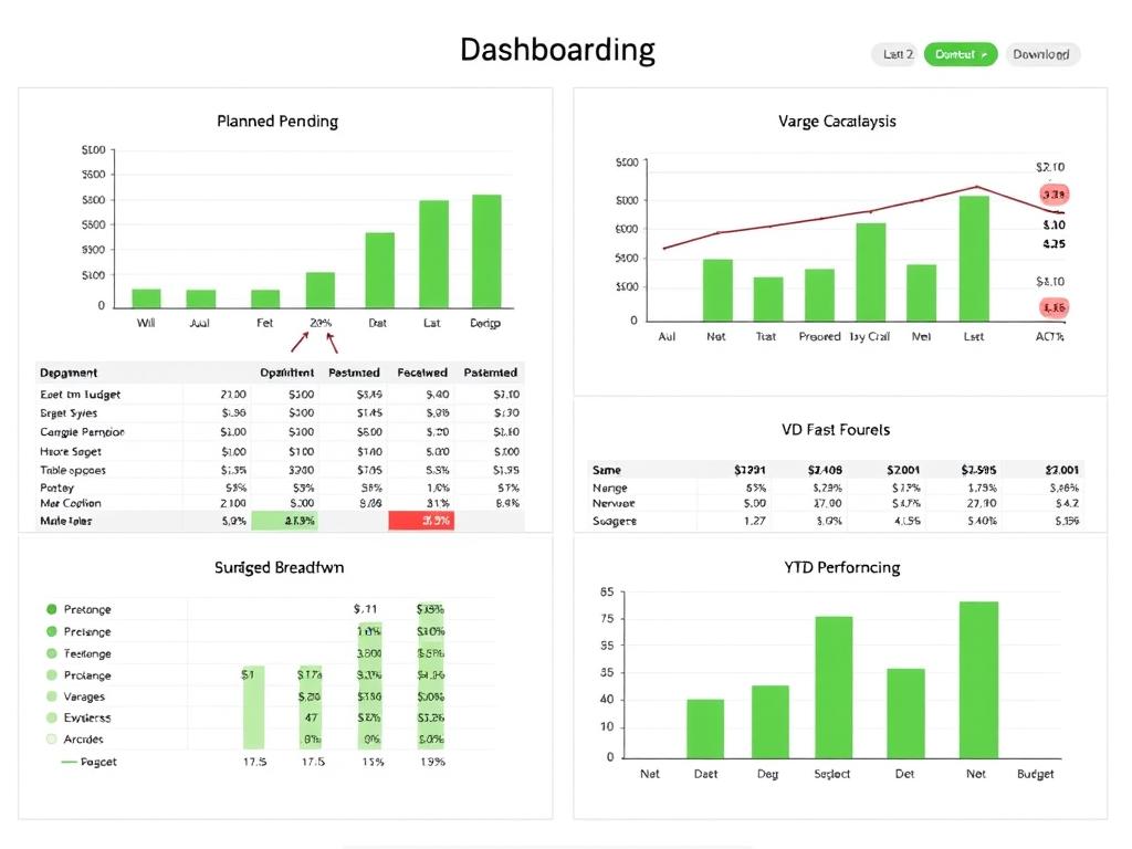
Ideal for financial managers monitoring performance against budgets. Features department-level breakdowns, variance analysis, and trend tracking to identify areas needing attention.
Small Business Financial Hub
![]()
Comprehensive solution for small business owners. Combines sales tracking, expense monitoring, cash flow projections, and profitability analysis in an easy-to-use format.
Need a Custom Financial Dashboard?
Join our free webinar to learn how to customize these templates for your specific business needs. We’ll walk through the process step-by-step and answer your questions live.
Financial Dashboard Best Practices
Follow these proven guidelines to create dashboards that deliver maximum value:
Design Principles
- Simplicity is key – Avoid cluttering your dashboard with too many metrics or visuals
- Use consistent formatting – Maintain uniform colors, fonts, and styling throughout
- Group related information – Organize metrics logically to tell a coherent story
- Highlight what matters – Use color and positioning to draw attention to critical insights
Technical Considerations
- Separate data and presentation – Keep raw data on hidden sheets
- Use Excel tables – They automatically expand and make formulas more reliable
- Build for performance – Minimize volatile functions and complex calculations
- Document your work – Add comments explaining complex formulas or data sources
Dashboard Do’s
- Update regularly with fresh data
- Include date of last update
- Provide context with benchmarks or targets
- Test with actual users before finalizing
- Include filters for personalized analysis
Dashboard Don’ts
- Overload with too many metrics
- Use 3D charts or excessive decoration
- Mix unrelated data in single visuals
- Rely on hard-coded values
- Forget to protect formulas and structure
Frequently Asked Questions
How often should I update my financial dashboard?
The update frequency depends on your business needs and data volatility. For most businesses, weekly or monthly updates are sufficient. However, cash-intensive businesses or those in rapid growth phases may benefit from daily updates to critical metrics like cash position or sales performance.
Can I connect my Excel dashboard to my accounting software?
Yes, Excel can connect to most popular accounting platforms. Use the “Get Data” feature (under the Data tab) to import data from QuickBooks, Xero, Sage, and other accounting software. For more complex integrations, Power Query provides robust options for data transformation and refreshing.
What’s the difference between a financial dashboard and a financial report?
Financial reports typically present detailed, structured financial information in a standardized format (like income statements or balance sheets). Dashboards, on the other hand, are visual, focused on key metrics, and designed for at-a-glance understanding. Reports are comprehensive and detailed; dashboards are selective and visual.
How do I choose which metrics to include in my dashboard?
Start by identifying your primary business objectives and the decisions you need to make. Select metrics that directly inform those decisions. Limit your main dashboard to 5-7 key metrics that provide a complete picture of financial health. Create secondary dashboards for deeper analysis of specific areas like cash flow or sales performance.
Is Excel powerful enough for complex financial dashboards?
Excel is surprisingly powerful for most business financial dashboards. With features like Power Query, Power Pivot, and dynamic arrays, Excel can handle millions of rows of data and complex calculations. For extremely large datasets or real-time analytics, dedicated BI tools like Power BI might be more appropriate, but Excel remains the most accessible and flexible option for most businesses.
How can I make my Excel dashboard update automatically?
There are several approaches: 1) Use Excel tables that automatically expand as data is added, 2) Create dynamic named ranges with OFFSET or INDEX functions, 3) Use Power Query to refresh data connections on a schedule, or 4) Write simple VBA macros to refresh data when the file opens. For cloud-based solutions, consider Power Automate for automated refresh schedules.
What’s the best way to share my Excel dashboard with others?
For internal teams, SharePoint or OneDrive provide collaborative access with controlled permissions. For broader distribution, consider: 1) Excel Online for interactive but controlled access, 2) PDF export for static snapshots, 3) Power BI publishing for interactive dashboards without exposing the underlying data, or 4) Scheduled email reports using Power Automate.
How do I protect sensitive financial data in my dashboard?
Implement these security measures: 1) Password-protect your Excel file, 2) Use worksheet protection to prevent structural changes, 3) Hide sheets containing raw data, 4) Use the Information Rights Management feature to control who can access, edit, or print the dashboard, and 5) Consider creating versions with different levels of detail for different audiences.
Can I use Excel dashboards for financial forecasting?
Absolutely. Excel is excellent for financial forecasting. Use features like What-If Analysis, Goal Seek, and Data Tables to model different scenarios. For more sophisticated forecasting, leverage Excel’s statistical functions like FORECAST.ETS or create regression models. Combine historical data visualization with forward-looking projections for comprehensive financial planning.
What are the most common mistakes when creating financial dashboards?
Common pitfalls include: 1) Information overload – including too many metrics, 2) Poor visual hierarchy – not emphasizing what’s most important, 3) Inconsistent updating – leading to outdated insights, 4) Lack of context – showing numbers without benchmarks or targets, 5) Inefficient data structure – making updates difficult, and 6) Ignoring user needs – creating technically impressive but practically unusable dashboards.
Transform Your Financial Decision-Making with Excel Dashboards
A well-designed financial dashboard in Excel can revolutionize how you understand and manage your business finances. By transforming complex data into clear, actionable insights, you’ll make better decisions faster and with greater confidence.
Remember that the most effective dashboards evolve over time. Start with the essential metrics for your business, implement the techniques outlined in this guide, and continuously refine based on user feedback and changing business needs.
Ready to Take Control of Your Business Finances?
Download our complete financial dashboard toolkit, including templates, video tutorials, and a step-by-step implementation guide.
Whether you’re a financial expert or just getting started with business analytics, Excel dashboards provide an accessible yet powerful way to gain financial clarity and drive business growth through informed decision-making.