This comprehensive guide will walk you through everything you need to know about creating, customizing, and leveraging Excel KPI dashboards for financial management. Whether you’re a startup founder tracking early growth metrics, a financial analyst preparing executive reports, or a business owner seeking better visibility into your operations, you’ll find practical templates and step-by-step instructions to transform your financial data into powerful visual insights.
Table of Contents
- What is a Business KPI Dashboard?
- Essential Financial KPIs to Track
- Step-by-Step Guide to Building Your KPI Dashboard
- Free Excel KPI Dashboard Templates
- Financial Analysis Example Using KPI Dashboards
- Advanced Dashboard Techniques
- Automating Your Financial Dashboard
- Common Mistakes to Avoid
- Frequently Asked Questions
What is a Business KPI Dashboard in Excel?
A well-designed business KPI dashboard in Excel provides at-a-glance visibility into critical financial metrics
A business KPI dashboard in Excel is a visual representation of your company’s most important financial and operational metrics. Think of it as your business’s instrument panel – providing a quick snapshot of performance across key areas that matter most to your financial success.
Unlike standard financial reports that often require deep analysis, a well-designed KPI dashboard presents complex data in an easily digestible format, allowing you to identify trends, spot potential issues, and make data-driven decisions quickly. The power of using Excel for this purpose lies in its accessibility, flexibility, and familiarity to most business professionals.
Why Excel is Ideal for Financial KPI Dashboards
Advantages of Excel KPI Dashboards
- Universal accessibility across organizations
- No additional software investment required
- Highly customizable to specific business needs
- Familiar interface reduces learning curve
- Powerful calculation capabilities
- Easy to share and distribute
- Can integrate data from multiple sources
Limitations to Consider
- Manual updates may be required
- Limited real-time data capabilities
- Can become unwieldy with very large datasets
- Version control challenges when shared
- Less sophisticated visualization than specialized tools
- Security concerns with sensitive financial data
- Performance issues with complex calculations
Despite these limitations, Excel remains the go-to choice for many financial professionals due to its flexibility, widespread adoption, and powerful data manipulation capabilities. With the right template and setup, you can create professional-grade dashboards that rival expensive business intelligence solutions.
Essential Financial KPIs to Track in Your Business Dashboard
Before diving into dashboard creation, it’s crucial to identify which financial metrics matter most for financial business planning for beginners and experienced professionals alike. The right KPIs will vary based on your industry, business model, and specific goals, but certain financial metrics are universally important.
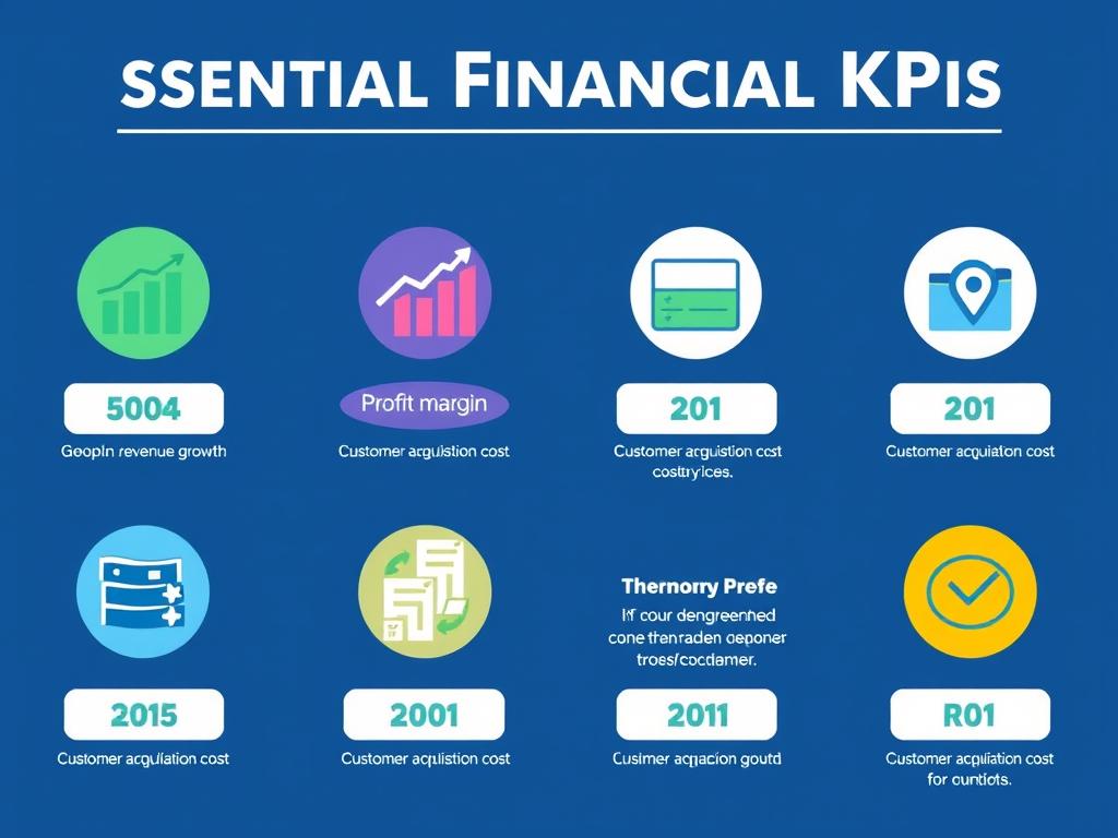
Core Financial Performance Metrics
| KPI Category | Key Metrics | Why It Matters | Ideal Dashboard Visualization |
| Profitability | Gross Profit Margin, Net Profit Margin, EBITDA | Measures your ability to generate earnings relative to revenue, assets, and operating costs | Line chart with trend analysis, gauge charts |
| Liquidity | Current Ratio, Quick Ratio, Operating Cash Flow | Indicates your ability to meet short-term obligations and fund operations | Gauge charts, waterfall charts for cash flow |
| Efficiency | Inventory Turnover, Accounts Receivable Turnover, Asset Turnover | Shows how effectively you’re using resources and managing operations | Bar charts, sparklines for trends |
| Growth | Revenue Growth Rate, Market Share Growth, Customer Growth Rate | Measures business expansion and market position improvements | Line charts with YoY comparison, area charts |
| Customer | Customer Acquisition Cost (CAC), Customer Lifetime Value (CLV), Churn Rate | Evaluates the economics of your customer relationships | Combo charts, trend lines with targets |
Industry-Specific Financial KPIs
While the core metrics above apply to most businesses, different industries have unique KPIs that should be incorporated into your dashboard for comprehensive financial business management:
Retail
- Sales per square foot
- Average transaction value
- Inventory shrinkage rate
- Same-store sales growth
SaaS/Technology
- Monthly Recurring Revenue (MRR)
- Customer Acquisition Cost (CAC)
- Churn rate
- Customer Lifetime Value (CLV)
Professional Services
- Utilization rate
- Project profitability
- Revenue per employee
- Realization rate
Need Help Identifying Your Most Important KPIs?
Download our free KPI Selection Framework to determine which metrics will have the biggest impact on your financial decision-making.
Step-by-Step Guide to Building Your Business KPI Dashboard in Excel
Creating an effective KPI dashboard doesn’t have to be complicated. Follow these steps to build a powerful financial tracking tool that will transform your business financial decision-making process.
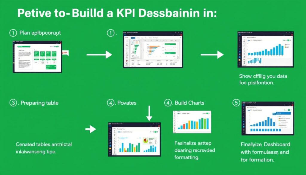
Step 1: Define Your Dashboard Objectives
Before opening Excel, clarify what you want your dashboard to achieve. This critical planning stage will guide all subsequent decisions and help you create a truly useful tool for financial business planning.
- Identify your audience: Are you creating this for executives, managers, or your own use? Different audiences need different levels of detail.
- Determine key decisions: What financial decisions will this dashboard inform? Focus on metrics that directly support these decisions.
- Set update frequency: Will this be updated daily, weekly, or monthly? This affects how you structure your data sources.
- Choose your KPIs: Based on the above, select 5-7 key metrics that will appear on your main dashboard.
Pro Tip: Resist the urge to track everything. A cluttered dashboard with too many metrics becomes difficult to interpret and loses its effectiveness. Focus on the vital few rather than the trivial many.
Step 2: Prepare Your Data Structure
A solid data foundation is essential for an effective dashboard. This step focuses on organizing your financial data in a way that supports easy analysis and visualization.
- Create a dedicated data sheet: Keep raw data separate from your dashboard visualizations.
- Format as a table: Use Excel’s table feature (Ctrl+T) to create dynamic ranges that expand as data is added.
- Standardize data formats: Ensure consistent date formats, number formats, and naming conventions.
- Set up data validation: Add dropdown lists and validation rules to prevent errors during data entry.
- Create calculation columns: Add derived metrics that will feed your dashboard (growth rates, ratios, etc.).
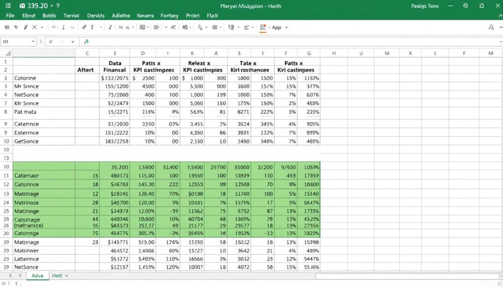
A well-structured data sheet forms the foundation of your KPI dashboard
Step 3: Design Your Dashboard Layout
An intuitive, well-organized layout is crucial for dashboard effectiveness. This step focuses on creating a visual structure that highlights your most important financial metrics.
Layout Best Practices:
- Place most important KPIs in the top-left (where eyes naturally go first)
- Group related metrics together
- Use consistent sizing and spacing
- Include a title, date range, and last updated timestamp
- Limit to one screen (no scrolling) if possible
Recommended Sections:
- Header with title and time period selectors
- Summary metrics (headline numbers)
- Trend visualizations (charts showing performance over time)
- Comparison metrics (actual vs. target, YoY growth)
- Drill-down sections (optional, for detailed analysis)
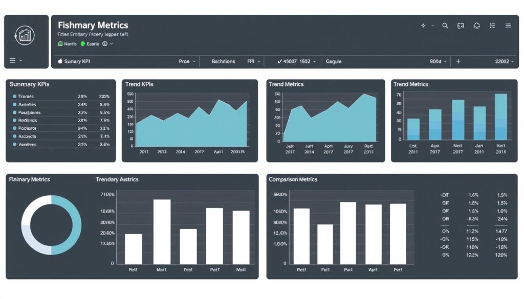
Example of a well-designed financial KPI dashboard layout
Step 4: Create Visualizations and Metrics Display
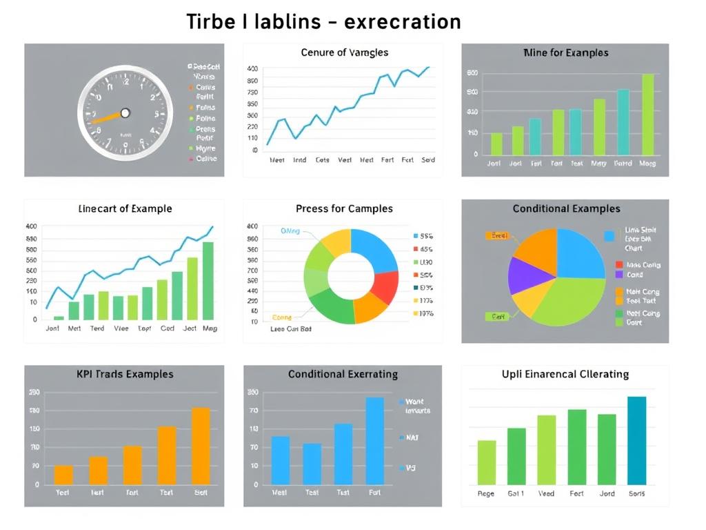
Now it’s time to bring your data to life with effective visualizations. The right chart types will make your financial data instantly understandable and highlight important trends.
| Metric Type | Recommended Visualization | Excel Implementation |
| Performance vs. Target | Gauge charts, bullet charts, or simple variance displays | Use conditional formatting with data bars or create custom gauge charts |
| Trends Over Time | Line charts, area charts, or sparklines | Insert > Charts > Line or Insert > Sparklines |
| Composition/Breakdown | Pie charts, stacked bar charts | Insert > Charts > Pie/Bar and modify as needed |
| Comparisons | Clustered column charts, bar charts | Insert > Charts > Column/Bar |
| KPI Summary | Card visualizations with RAG (Red-Amber-Green) indicators | Use shapes with text boxes and conditional formatting |
Step 5: Add Interactivity and Automation
Transform your static dashboard into an interactive tool that allows for deeper analysis and saves time through automation. This step is crucial for how to automate financial business processes.
Interactive Elements:
- Slicers: Add filtering capabilities to easily segment data
- Drop-down selectors: Allow users to choose different time periods or data views
- Form controls: Create interactive elements like scrollbars to adjust parameters
- Hyperlinks: Add navigation to detailed analysis sheets
Automation Features:
- Dynamic named ranges: Automatically expand as new data is added
- OFFSET and INDIRECT functions: Create dynamic chart ranges
- Data connections: Link to external data sources for automatic updates
- VBA macros: Automate repetitive tasks and refresh procedures
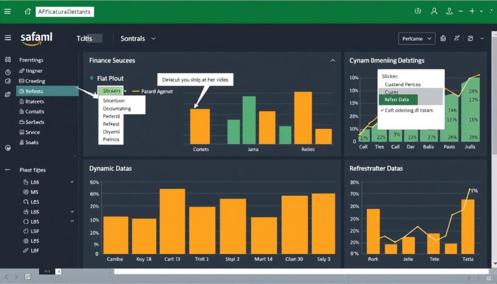
Interactive elements transform static dashboards into powerful analysis tools
Ready to Build Your Own Financial Dashboard?
Download our step-by-step tutorial with sample files to follow along and create your custom KPI dashboard today.
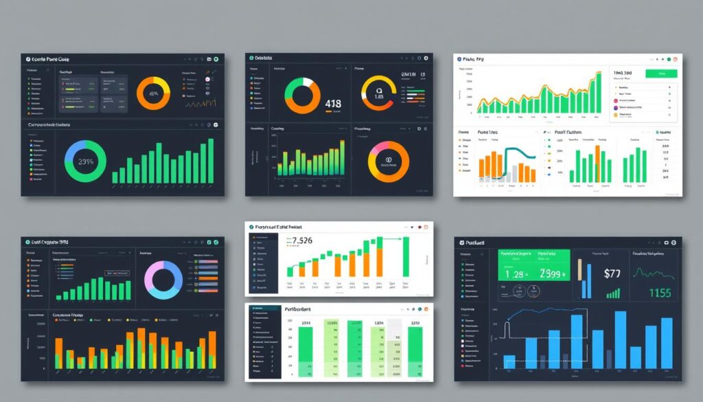
Free Excel KPI Dashboard Templates for Financial Business Management
Why start from scratch when you can leverage professionally designed templates? These free Excel KPI dashboard templates will jumpstart your financial business management efforts and can be customized to your specific needs.
1. Executive Financial Dashboard Template
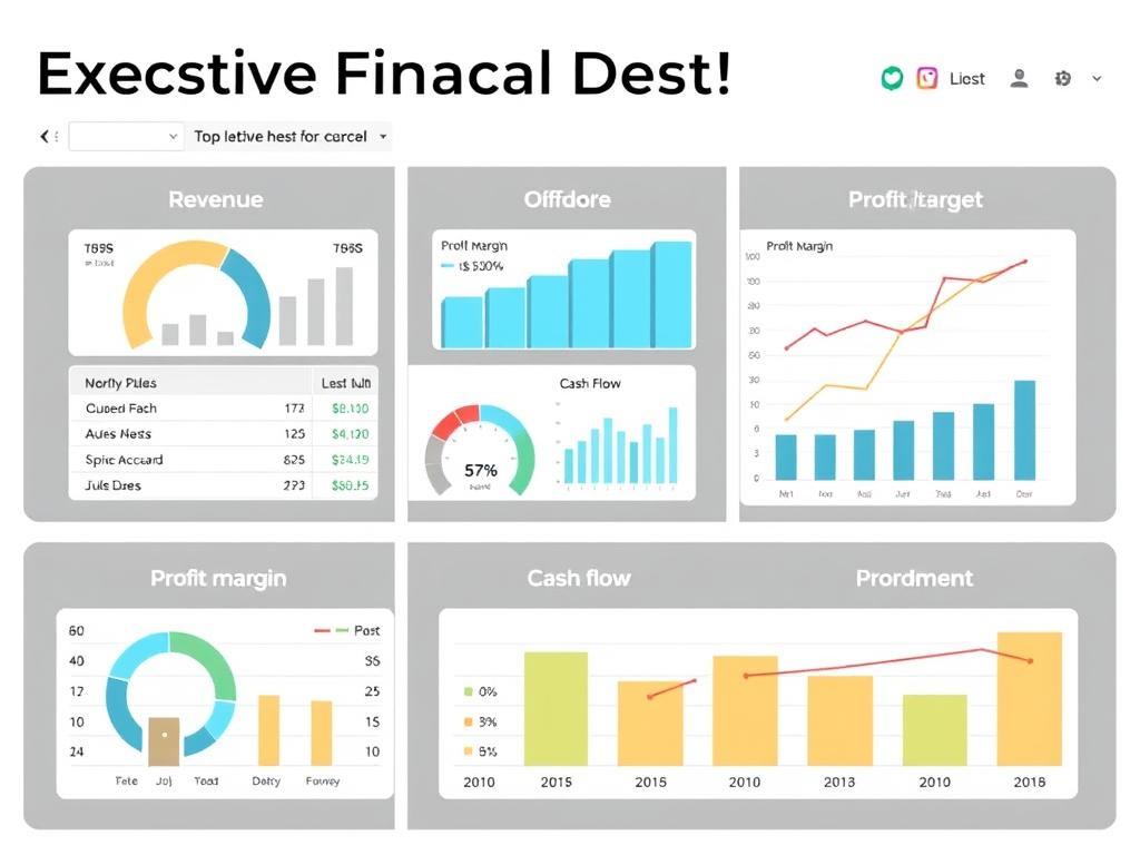
Perfect for: C-Suite Executives, Business Owners, Investors
This comprehensive template provides a high-level view of your company’s financial health with a focus on the metrics that matter most to executive decision-making.
- Key Features: Revenue trends, profit margin analysis, cash flow visualization, ROI tracking
- Visualizations: Executive summary cards, trend lines, performance gauges, variance analysis
- Customization: Easy color scheme adjustment, flexible metric selection, adjustable time periods
This template is ideal for monthly board meetings, quarterly reviews, and strategic planning sessions where a comprehensive financial overview is needed.
2. Cash Flow Management Dashboard Template
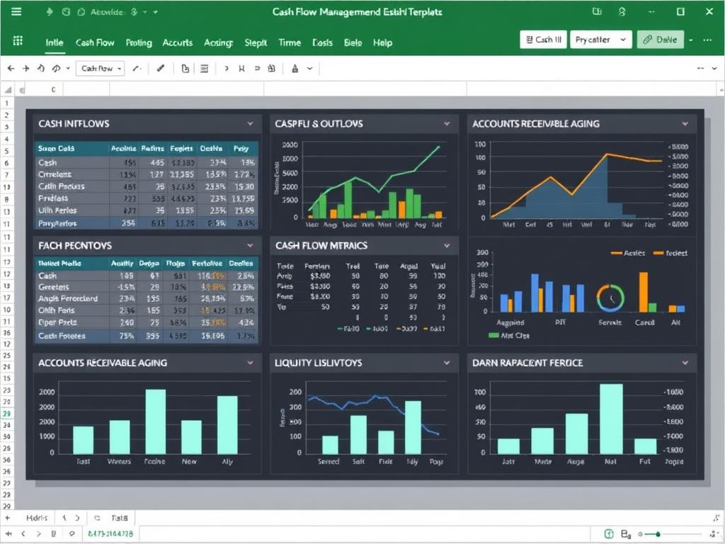
Perfect for: Financial Controllers, Treasurers, Small Business Owners
Monitor and forecast your cash position with this specialized template designed to help you implement effective financial business cash flow improvement tips.
- Key Features: Cash flow forecasting, accounts receivable aging, accounts payable scheduling, working capital analysis
- Visualizations: Waterfall charts, aging charts, timeline views, liquidity gauges
- Customization: Adjustable forecast periods, customizable cash categories, scenario modeling
This template helps you anticipate cash shortfalls, optimize payment timing, and ensure you always have sufficient liquidity to operate your business.
3. Financial Ratio Analysis Dashboard Template
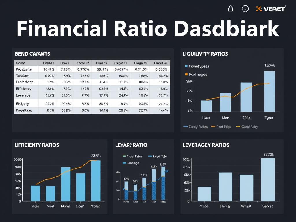
Perfect for: Financial Analysts, Accountants, Investors
Dive deep into your company’s financial health with this comprehensive ratio analysis template that helps you understand financial business ratios explained in visual format.
- Key Features: Profitability ratios, liquidity ratios, efficiency ratios, solvency ratios with benchmarking
- Visualizations: Comparison charts, trend analysis, radar charts for multi-ratio analysis
- Customization: Industry benchmark inputs, target setting, historical comparison periods
This template is perfect for quarterly financial reviews, investor presentations, and identifying areas for financial improvement.
4. Budget vs. Actual Dashboard Template
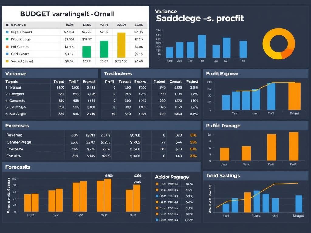
Perfect for: Finance Managers, Department Heads, Budget Analysts
Track your performance against budget with this template designed to support effective financial business budgeting strategies.
- Key Features: Budget vs. actual comparison, variance analysis, YTD performance, forecast adjustments
- Visualizations: Variance charts, progress bars, heat maps for variance highlighting
- Customization: Departmental filtering, expense categorization, variance threshold adjustments
This template helps you identify budget overruns early, adjust forecasts based on actual performance, and maintain financial discipline across your organization.
5. Startup Financial Metrics Dashboard Template
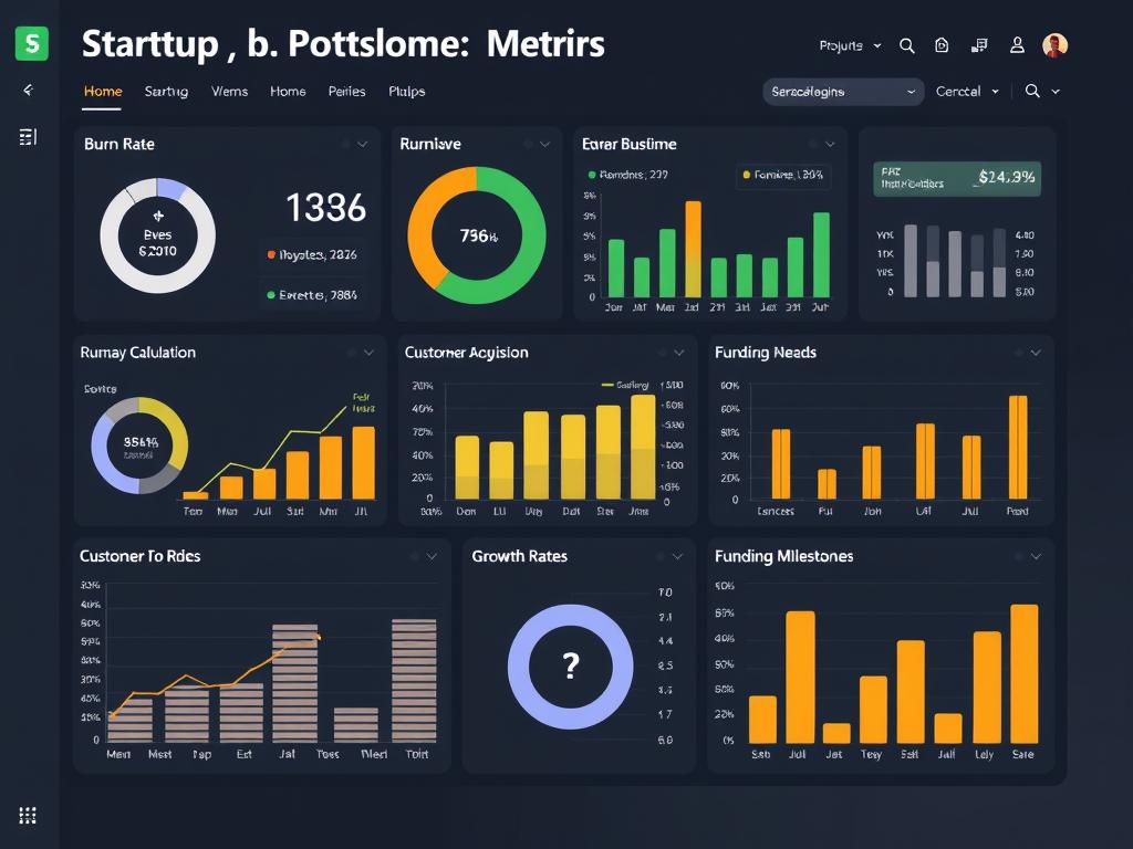
Perfect for: Startup Founders, Investors, Incubators
Designed specifically for early-stage companies, this template focuses on the unique metrics needed for financial business management for startups.
- Key Features: Burn rate, runway calculation, CAC, LTV, growth metrics, funding milestone tracking
- Visualizations: Growth curves, cohort analysis, unit economics breakdown
- Customization: Funding scenario modeling, growth projection adjustments, milestone setting
This template helps startup founders track the metrics that matter most to investors, make data-driven growth decisions, and monitor cash runway.
Need a Custom Dashboard Solution?
Download our complete template bundle with 10+ specialized financial dashboards, plus receive monthly updates with new templates and features.
Financial Analysis Example Using KPI Dashboards
Let’s explore a real-world example of how a business KPI dashboard in Excel can transform financial analysis and decision-making. This case study demonstrates the practical application of dashboards for small business financial analysis.
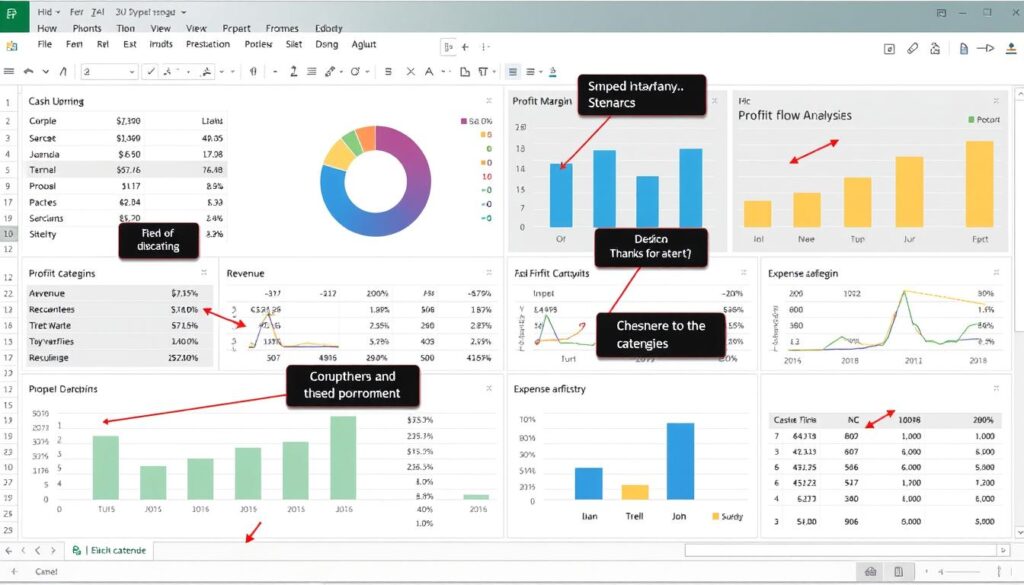
Sample financial analysis dashboard highlighting key insights
Company Background: Midwest Manufacturing, Inc.
Midwest Manufacturing is a mid-sized manufacturer of industrial components with $12M in annual revenue. The CFO implemented a comprehensive financial KPI dashboard to address several challenges:
- Declining profit margins despite revenue growth
- Inconsistent cash flow creating operational challenges
- Difficulty identifying which product lines were most profitable
- Lack of visibility into departmental budget performance
Dashboard Implementation and Key Findings
The company created a multi-tab Excel dashboard with these key components:
Executive Summary
High-level KPIs showing overall financial health with trend indicators
Revenue was growing at 15% YoY, but profit margins had declined from 22% to 17% over 18 months
Product Profitability
Breakdown of margin by product line with volume analysis
The fastest-growing product line (Industrial Pumps) had the lowest margin at 12%, dragging down overall profitability
Cash Flow Analysis
Cash flow forecasting with AR/AP aging analysis
Average collection period had increased from 32 to 47 days, creating cash flow constraints
Actions Taken Based on Dashboard Insights
| Dashboard Insight | Action Taken | Financial Impact |
| Low margins on Industrial Pumps line | Implemented 5% price increase on low-margin products and renegotiated supplier contracts | Margin improved to 18%, adding $240K in annual profit |
| Extended AR collection period | Revised credit terms, implemented early payment discounts, and added dedicated AR follow-up resources | Reduced average collection to 36 days, freeing up $380K in cash |
| Manufacturing overhead increasing faster than production volume | Conducted efficiency audit, consolidated shifts, and optimized staffing | Reduced overhead by $175K annually without impacting output |
| Seasonal cash flow constraints in Q3 | Adjusted inventory purchasing schedule and negotiated extended terms with key suppliers during Q3 | Eliminated need for $250K seasonal credit line, saving $12K in interest |
Results and ROI
Within six months of implementing the Excel KPI dashboard, Midwest Manufacturing achieved:
The total financial impact exceeded $800K in the first year, with an implementation cost of just $15K (primarily staff time for dashboard development and training), representing an ROI of over 5,000%.
“The Excel KPI dashboard transformed our financial management. Instead of digging through reports to find issues, we now immediately see where to focus our attention. It’s like having financial GPS for our business.”
Want to Achieve Similar Results?
Download our case study collection with detailed examples of how businesses across different industries have used Excel KPI dashboards to improve financial performance.
Advanced Dashboard Techniques for Financial Excellence
Once you’ve mastered the basics, these advanced techniques will help you create even more powerful dashboards for how to improve financial business efficiency.
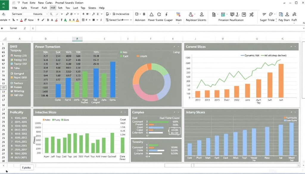
Dynamic Data Ranges and Formulas
Make your dashboard automatically adapt to new data without manual adjustments:
- OFFSET function: Create dynamic ranges that expand as new data is added
- INDIRECT function: Reference cells by using text strings to create flexible formulas
- Dynamic named ranges: Define ranges that automatically include new data rows
- TABLE objects: Convert data to tables for automatic expansion and structured references
Example Formula: To create a dynamic chart range that automatically includes new monthly data:
=OFFSET(Sheet1!$B$2,0,0,COUNTA(Sheet1!$B:$B)-1,1)
Advanced Data Connections and Power Query
Transform your dashboard from a static report to a dynamic data tool:
- External data connections: Link to databases, accounting systems, or cloud services
- Power Query: Transform and clean data before it enters your dashboard
- Data consolidation: Combine data from multiple sources into a unified dashboard
- Scheduled refreshes: Set up automatic data updates on a regular schedule
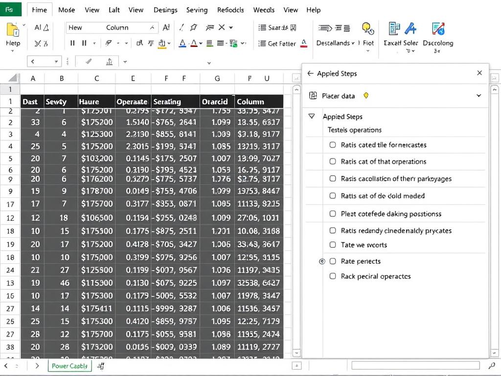
Power Query allows for sophisticated data transformation before it reaches your dashboard
Conditional Formatting and Visual Cues
Enhance dashboard readability with visual indicators that highlight important information:
Basic Techniques:
- Color scales for gradual performance indicators
- Icon sets for status indicators (up/down arrows, traffic lights)
- Data bars for visual comparison within cells
- Custom rules based on complex formulas
Advanced Applications:
- Highlight entire rows based on threshold conditions
- Create in-cell charts with REPT function and character symbols
- Use custom number formats to display trends within values
- Implement dynamic threshold changes based on user input
Dashboard Protection and Controlled Interactivity
Balance user flexibility with data integrity:
- Sheet protection: Lock dashboard elements while allowing specific interactive areas
- Data validation: Control user inputs to prevent errors
- Form controls: Add buttons, checkboxes, and dropdown lists for controlled interactivity
- Input areas: Create dedicated cells for user parameters and assumptions
Master Advanced Excel Dashboard Techniques
Download our advanced techniques guide with step-by-step instructions and example files to implement these powerful features in your own dashboards.
Automating Your Financial Dashboard for Greater Efficiency
Manual updates are time-consuming and error-prone. Learn how to automate financial business processes by setting up your Excel dashboard for maximum efficiency.
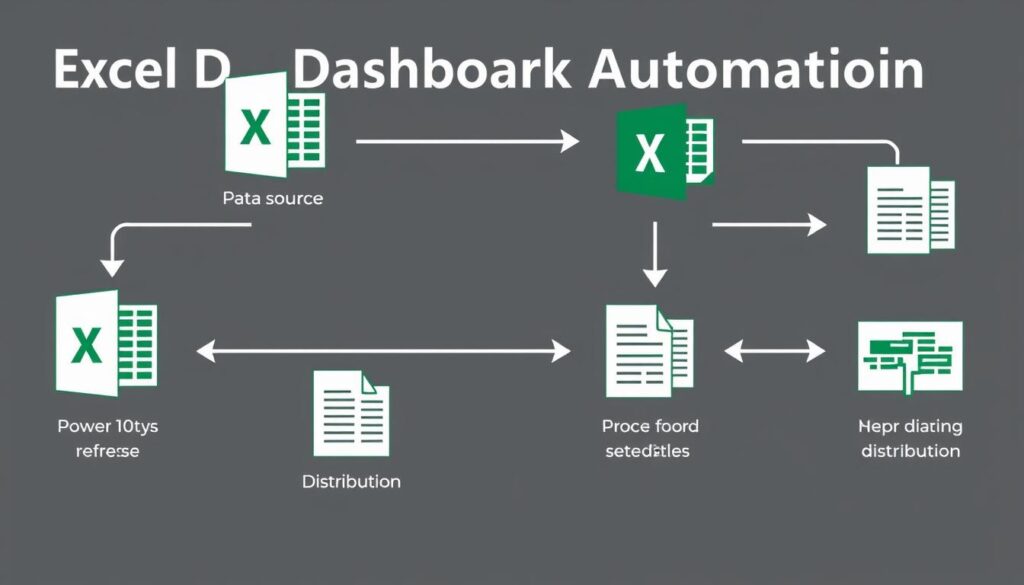
Data Collection Automation
Eliminate manual data entry with these automation techniques:
- Direct database connections: Connect Excel directly to your accounting system or ERP
- API integrations: Pull data from cloud services like QuickBooks, Xero, or Salesforce
- Web queries: Automatically extract data from internal web reports or portals
- Email automation: Set up systems to email data files that automatically update your dashboard
Calculation and Refresh Automation
Ensure your dashboard always shows the latest information:
- VBA macros: Create scripts that refresh data connections and recalculate formulas
- Power Query refresh: Schedule automatic data refreshes at set intervals
- Windows Task Scheduler: Set up automated opening and refreshing of your dashboard file
- OneDrive/SharePoint automation: Leverage cloud storage platforms for automated workflows
Pro Tip: When setting up automation, always include error handling and notification systems. A simple email alert when data doesn’t refresh properly can save hours of troubleshooting later.
Distribution and Sharing Automation
Get the right information to the right people automatically:
Internal Sharing:
- Scheduled email distribution of dashboard as PDF
- Automated uploads to shared drives or intranet
- Excel Online/SharePoint for real-time access
- Teams/Slack integration for key metrics sharing
External Sharing:
- Secure client portals with dashboard access
- Scheduled reports to investors or stakeholders
- Automated exports to presentation formats
- Protected view-only versions for broader distribution
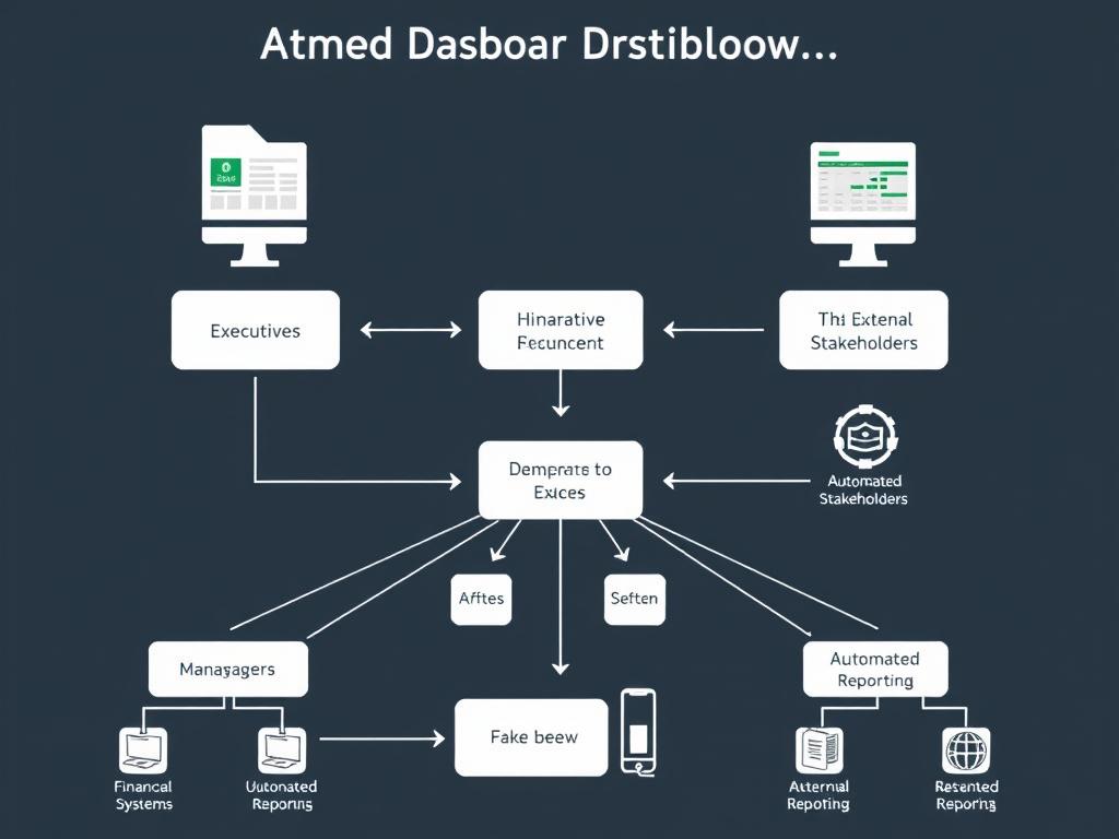
Automated distribution ensures the right information reaches the right people at the right time
Third-Party Tools for Enhanced Automation
Extend Excel’s capabilities with specialized tools:
| Tool Category | Popular Options | Key Benefits |
| Data Connection Tools | Power BI, Zapier, Supermetrics | Connect to virtually any data source without coding; scheduled refreshes |
| Automation Platforms | Microsoft Power Automate, Integromat, Workato | Create complex workflows across multiple systems; trigger-based automation |
| Dashboard Enhancement | XLCubed, Tableau, Power BI Desktop | Advanced visualizations; interactive filtering; mobile optimization |
| Collaboration Solutions | SharePoint, OneDrive, Google Sheets | Real-time collaboration; version control; access management |
Automate Your Financial Reporting
Download our automation toolkit with pre-built VBA scripts, Power Query templates, and step-by-step guides to save hours on your financial reporting process.
Common Mistakes to Avoid in Financial Dashboard Creation
Even experienced financial professionals can fall into these common traps when creating KPI dashboards. Learn how to avoid them to ensure your dashboard delivers maximum value.
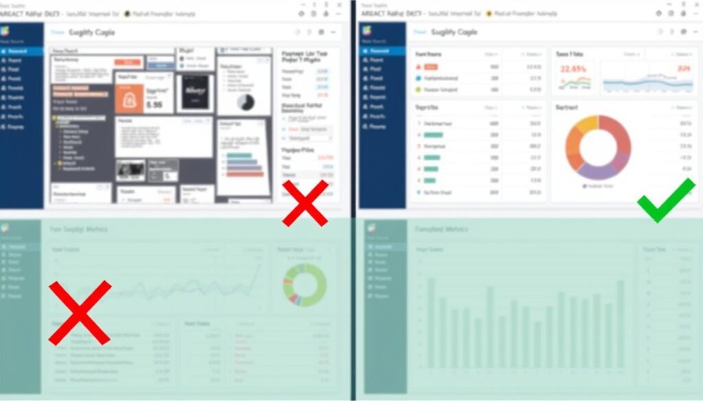
Design and Usability Mistakes
Common Mistakes
- Cluttering the dashboard with too many metrics
- Using inappropriate chart types for the data
- Inconsistent formatting and color schemes
- Poor layout with no clear visual hierarchy
- Tiny text and cramped visualizations
Best Practices
- Focus on 5-7 key metrics per dashboard view
- Select chart types that best represent the data relationship
- Maintain consistent formatting and meaningful color usage
- Create clear visual hierarchy with most important metrics prominent
- Ensure readability with adequate spacing and font sizes
Data Integrity and Formula Mistakes
Common Mistakes
- Hard-coding values instead of using cell references
- Creating complex nested formulas without documentation
- Failing to validate data accuracy
- Using static ranges that don’t accommodate new data
- Mixing data types (text/numbers) in calculation columns
Best Practices
- Use cell references and named ranges for all calculations
- Break complex formulas into steps with clear documentation
- Implement data validation and cross-checking
- Use dynamic ranges or Excel Tables for expandable data
- Maintain consistent data types and formats
Strategic and Implementation Mistakes
Common Mistakes
- Creating dashboards without clear business objectives
- Failing to consider the dashboard’s audience
- Not providing context for the metrics (targets, benchmarks)
- Making the dashboard too complex for users
- No maintenance plan for ongoing updates
Best Practices
- Start with clear objectives linked to business goals
- Design with the end user in mind (executives vs. analysts)
- Include relevant context for all metrics (targets, historical data)
- Balance sophistication with usability
- Create documentation and maintenance procedures
“The most common mistake I see is dashboards that try to show everything but end up communicating nothing. A great financial dashboard isn’t about displaying all your data—it’s about highlighting the critical few metrics that drive decisions.”
Create Flawless Financial Dashboards
Download our dashboard review checklist to ensure your financial dashboards avoid these common pitfalls and deliver maximum value to your organization.
Frequently Asked Questions About Business KPI Dashboards in Excel
How often should I update my financial KPI dashboard?
The optimal update frequency depends on your business needs and the metrics you’re tracking. For operational metrics like cash flow or sales, daily or weekly updates may be necessary. For strategic financial metrics like profit margins or ROI, monthly updates are typically sufficient. The key is to match the update frequency to the decision-making cadence of the dashboard users. For executive dashboards, monthly updates aligned with financial close processes often work best.
What’s the difference between a KPI dashboard and a financial report?
A financial report typically provides comprehensive, detailed financial information in a standardized format (like income statements or balance sheets) and is often backward-looking. A KPI dashboard, on the other hand, is more focused and visual, highlighting specific metrics that drive decision-making. Dashboards often include forward-looking elements like forecasts and trends, and they’re designed for quick comprehension rather than detailed analysis. Think of reports as providing depth while dashboards provide focus and context.
How can I create a KPI dashboard if I’m not an Excel expert?
You don’t need to be an Excel guru to create an effective KPI dashboard. Start with pre-built templates (like those offered in this article) and customize them to your needs. Focus on a few key metrics rather than creating something complex. Use basic charts like column, line, and pie charts that are easy to create. As you become more comfortable, you can gradually add more sophisticated elements. Remember that a simple, focused dashboard that gets used is far better than a complex one that doesn’t.
How do I choose which KPIs to include in my financial dashboard?
Start by identifying your key business objectives and the financial metrics that best indicate progress toward those goals. For most businesses, include a mix of profitability metrics (margins, EBITDA), liquidity measures (cash flow, working capital), and growth indicators (revenue growth, customer acquisition). Limit your main dashboard to 5-7 key metrics to maintain focus. Consider your audience—executives may want high-level metrics while department managers need more operational KPIs. Finally, ensure the metrics are actionable—if a number changes, is it clear what actions should be taken?
Can Excel handle large amounts of financial data for dashboards?
Excel can handle substantial amounts of data, but there are limits. Modern versions of Excel (2019 and later) can manage over a million rows, but performance may degrade with very large datasets. For optimal dashboard performance with large datasets, consider: 1) Using Power Query to import and transform only the necessary data, 2) Creating summary tables rather than referencing raw data directly, 3) Utilizing PivotTables to analyze large datasets efficiently, and 4) For truly massive datasets, consider using Power BI with Excel as the front-end visualization tool.
How can I make my Excel dashboard update automatically?
Several approaches can automate Excel dashboard updates: 1) Use Power Query to create connections to your data sources with refresh capabilities, 2) Create VBA macros that refresh data connections and recalculate the workbook, 3) Schedule automatic refreshes using Windows Task Scheduler to open and update the file, 4) For cloud-based solutions, use Power Automate (formerly Flow) to trigger updates based on schedule or events, or 5) Consider third-party automation tools like Zapier or Integromat that can push data to Excel on a schedule. The best approach depends on your data sources and technical environment.
What are the best visualization types for financial KPIs?
Different financial KPIs are best visualized with specific chart types: 1) Time-series data (like revenue trends or cash flow) works best with line charts, 2) Comparisons between categories (like departmental expenses) are clearest with bar or column charts, 3) Part-to-whole relationships (like revenue composition) work well with pie or stacked bar charts, 4) Performance against targets can be shown with bullet charts or gauge charts, and 5) Sparklines are excellent for showing trends in a compact space. Always choose the simplest visualization that effectively communicates the insight.
How do I share my Excel KPI dashboard with stakeholders?
Several options exist for sharing Excel dashboards: 1) Email the Excel file directly (best for small groups with Excel access), 2) Save to a shared drive or SharePoint for collaborative access, 3) Use Excel Online/Office 365 for web-based viewing and limited editing, 4) Export key views as PDF for formal distribution, 5) Schedule automated emails with dashboard screenshots or PDFs for regular updates, or 6) Present live during meetings for interactive discussion. Consider your audience’s technical capabilities and whether they need interactive features or just the insights when choosing a sharing method.
How can I protect sensitive financial data in my Excel dashboard?
To secure financial data in Excel dashboards: 1) Use Excel’s built-in protection features to lock cells and sheets, 2) Create view-only versions with sensitive calculations hidden, 3) Password-protect the file and consider file encryption, 4) Utilize Excel’s Information Rights Management if available in your organization, 5) Consider creating separate versions with different access levels for different audiences, 6) For highly sensitive data, keep raw data in a separate, secured file and use Power Query connections, and 7) Implement proper file sharing and permission protocols. Always balance security with usability based on your organization’s needs.
What are the alternatives to Excel for creating financial KPI dashboards?
While Excel is versatile and accessible, alternatives include: 1) Power BI—Microsoft’s dedicated business intelligence tool with stronger visualization and data connection capabilities, 2) Tableau—Powerful visualization software with excellent interactive features, 3) Google Sheets—Cloud-based spreadsheet with good collaboration features but fewer advanced capabilities than Excel, 4) Specialized financial dashboarding software like Klipfolio, Databox, or Geckoboard, and 5) Enterprise BI solutions like Domo, Looker, or Qlik. The best choice depends on your budget, technical resources, data complexity, and collaboration needs.
Still Have Questions?
Download our comprehensive Excel KPI Dashboard Guide with detailed answers to these questions and many more.
Conclusion: Transform Your Financial Management with Excel KPI Dashboards
A well-designed business KPI dashboard in Excel is more than just a reporting tool—it’s a powerful catalyst for improved financial decision-making and business performance. By following the steps and best practices outlined in this guide, you can create dashboards that transform complex financial data into clear, actionable insights.
Whether you’re a startup founder looking to track growth metrics, a financial analyst preparing executive reports, or a business owner seeking better visibility into your operations, Excel KPI dashboards provide an accessible, flexible solution for financial business management and financial business growth strategies.
Remember that the most effective dashboards evolve over time. Start with the templates provided, customize them to your specific needs, and continuously refine based on user feedback and changing business priorities. With each iteration, your dashboards will become more valuable tools for driving financial success.
Ready to Transform Your Financial Reporting?
Download our complete Business KPI Dashboard Excel Template Bundle with 10+ customizable templates, video tutorials, and bonus automation scripts.